搭建门面 | SooMooc 直播平台
前端所有代码已经同步到 GitHub Repo: EthanLuu/soomooc: React + TypeScript 实践,在线教学直播平台。 (github.com)
项目的界面只是初步设计,后续还会随着功能的变更而更改界面
Header
先去 iconfont-阿里巴巴矢量图标库 上挑选一个合适的图标作为网站的 LOGO。

下载之后放到 assets 文件夹中。
新建 /components/header.tsx 组件,用来存放我们网站的公共页头。
简单写一点样式,用上 antd 提供的布局组件和按钮组件等。
我这边写了很多行内样式,后续考虑如果需要复用的话会抽象成组件。
import styled from '@emotion/styled'
import { Button, Layout, Menu, Row, Typography } from 'antd'
import ButtonGroup from 'antd/lib/button/button-group'
import logo from 'assets/logo.svg'
import { Search } from 'components/search'

export const Header = () => {
  return (
    <Layout.Header
      style={{
        background: 'white',
        boxSizing: 'border-box',
        boxShadow: '0 2px 8px #f0f1f2',
      }}
    >
      <Row style={{ height: '6.4rem', alignItems: 'center' }}>
        <a href={'/'} style={{ width: '20rem' }}>
          <Logo src={logo} alt="logo" />
          <Typography.Title
            level={3}
            style={{
              lineHeight: '6.4rem',
              marginBottom: 0,
              marginLeft: '6rem',
            }}
          >
            SooMooc
          </Typography.Title>
        </a>
        <Menu
          theme="light"
          mode="horizontal"
          defaultSelectedKeys={['1']}
          style={{ background: 'white', border: 'none', flex: 'auto' }}
        >
          <Menu.Item key="1">首页</Menu.Item>
          <Menu.Item key="2">课程</Menu.Item>
        </Menu>
        <Search />
        <ButtonGroup
          style={{
            alignItems: 'center',
          }}
        >
          <Button type="link">注册</Button>
          <Button type="link">登陆</Button>
        </ButtonGroup>
      </Row>
    </Layout.Header>
  )
}

const Logo = styled.img`
  height: 5rem;
  width: 5rem;
  float: left;
  margin: 0.7rem 0;
`
单独写的一个搜索框的组件 /components/search.tsx
import { Input } from 'antd'

export const Search = () => {
  const handleSearch = () => {}
  return (
    <Input.Search
      placeholder={"搜索课程"}
      style={{ width: 300, paddingRight: '5rem' }}
      onSearch={handleSearch}
    />
  )
}
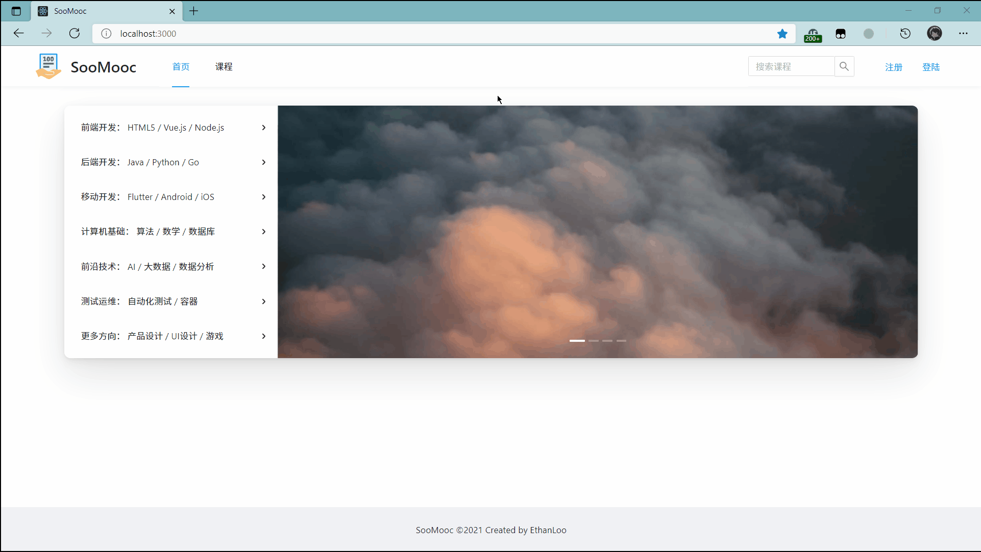
效果图,还不错。
Footer
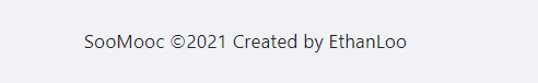
我直接用 antd 的组件写了一个很简单的页脚。
import { Layout } from 'antd'

export const Footer = () => {
  return (
    <Layout.Footer style={{ textAlign: 'center' }}>
      SooMooc ©2021 Created by EthanLoo
    </Layout.Footer>
  )
}
Content
先把首页的大致样子做了一下。
参考的网站为慕课网。

包括两个最主要的组件。
- SideMenu,左边的可扩展菜单。
- Carousel,右边的轮播图(走马灯)。
在写组件前,首先把需要的数据,存到 __json_server_mock__/db.json 文件中去。
首先是菜单的内容,每个菜单可以包括子菜单。
"sideMenuList": [
    {
      "id": 1,
      "title": "前端开发: HTML5 / Vue.js / Node.js",
      "subMenu": [
        {
          "id": 8,
          "title": "HTML5"
        },
        {
          "id": 9,
          "title": "Vue.js"
        },
        {
          "id": 10,
          "title": "Node.js"
        }
      ]
    }
  //...
]
然后我去网上随便找了几张图,并且使用 PicGo 上传到了自己的图床上。
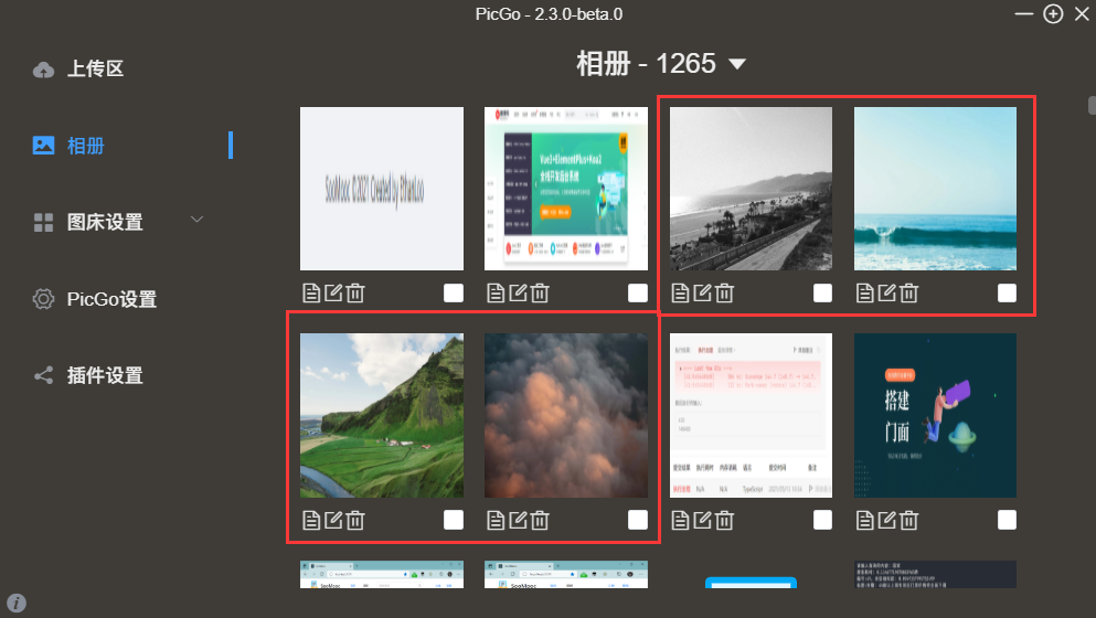
再把对应的图片的地址存到 db.json 文件中,需要保证通过接口可以获取对应地址。
"carousel": [
  {
    "id": 1,
    "title": "carousel-1",
    "url": "https://cdn.ethanloo.cn/img/20210513154859.webp"
  },
  {
    "id": 2,
    "title": "carousel-2",
    "url": "https://cdn.ethanloo.cn/img/20210513154902.webp"
  },
  {
    "id": 3,
    "title": "carousel-3",
    "url": "https://cdn.ethanloo.cn/img/20210513154901.webp"
  },
  {
    "id": 4,
    "title": "carousel-4",
    "url": "https://cdn.ethanloo.cn/img/20210513154900.webp"
  }
]
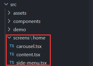
然后开始写主页相关的组件,都放在 src/screens/home 文件夹下。
主页内容框架组件 content.tsx,将 Carousel 和 SideMenu 整合到一起,在这儿使用 antd 提供的 Grid 布局,让左边的菜单占总宽度的 1/4,右边的轮播图占总宽度的 3/4。
为了让网站更美观,我还给这个 SideMnu 和 Carousel 组合起来的外边界加了个阴影。
使用的是这个工具,可以直接通过可视化界面写出阴影的 CSS 代码。
import styled from '@emotion/styled'
import { Row, Col } from 'antd'
import { Carousel } from 'screens/home/carousel'
import { SideMenu } from './side-menu'

export const Content = () => {
  return (
    <Container>
      <Banner>
        <Col span={6}>
          <SideMenu />
        </Col>
        <Col span={18}>
          <Carousel />
        </Col>
      </Banner>
    </Container>
  )
}

const Container = styled.div`
  padding: 3rem 10rem;
  margin: 0 auto;
  min-height: calc(100vh - 134px);
`

const Banner = styled(Row)`
  border-radius: 1rem;
  overflow: hidden;
  box-shadow: 0 1.9px 4px rgba(0, 0, 0, 0.044),
    0 4.6px 13.4px rgba(0, 0, 0, 0.066), 0 26px 60px rgba(0, 0, 0, 0.11);
`
接下去继续写 SideMenu.tsx,这是一个比较经典的流程(就我目前理解而言)。
- 利用
MenuItemProp接口来定义每个菜单项的数据格式。 - 利用
useState将菜单的数据存储在状态中。 - 使用
useEffect在首次加载该页面的时候,通过 API 获取所有菜单的数据,并且更新状态。 - 使用状态中的数据生成组件并返回。
这个 SideMenu 组件唯一特殊的点就是我把菜单的数据结构定义为了统一的,也就是说无论是否有父菜单还是子菜单,都使用一样的数据结构。在渲染菜单的时候,通过利用函数的递归,来渲染父菜单和子菜单项。
import styled from '@emotion/styled'
import { Menu } from 'antd'
import { useEffect, useState } from 'react'
import { http } from 'utils/http'

interface MenuItemProp {
  id: number
  title: string
  subMenu?: MenuItemProp[]
}

export const SideMenu = () => {
  const { SubMenu } = Menu
  const [menuItems, setMenuItems] = useState<MenuItemProp[]>([])
  useEffect(() => {
    http('sideMenuList').then((MenuItems: MenuItemProp[]) => {
      setMenuItems(MenuItems)
    })
  }, [])

  const renderMenu = (items: MenuItemProp[]) => {
    return items.map((item) => {
      if (item.subMenu) {
        return (
          <SubMenu key={item.id} title={item.title} style={{ flex: 'auto' }}>
            {renderMenu(item.subMenu)}
          </SubMenu>
        )
      } else {
        return <Menu.Item key={item.id}>{item.title}</Menu.Item>
      }
    })
  }

  return <MenuContainer mode="vertical">{renderMenu(menuItems)}</MenuContainer>
}

const MenuContainer = styled(Menu)`
  display: flex;
  flex-direction: column;
  justify-items: space-around;
  height: 100%;
  padding: 1rem 0 0.5rem 1rem;
`
Carousel.tsx走马灯组件相比而言更简单一些,利用 antd 提供的 Carousel 组件可以很容易写出。
定义数据结构和调取接口的流程和上一个菜单组件一样。
import styled from '@emotion/styled'
import { Image, Carousel as AntCarousel } from 'antd'
import { useEffect, useState } from 'react'
import { http } from 'utils/http'

interface CarouselImageProp {
  id: number
  title: string
  url: string
}

export const Carousel = () => {
  const [imageUrls, setImageUrls] = useState<CarouselImageProp[]>([])

  useEffect(() => {
    http('carousel').then((urls: CarouselImageProp[]) => {
      setImageUrls(urls)
    })
  }, [])

  return (
    <CarouselContainer autoplay>
      {console.log(imageUrls)}
      {imageUrls.map((image) => (
        <Image src={image.url} key={image.id} object-fit={'heroImage'} />
      ))}
    </CarouselContainer>
  )
}

const CarouselContainer = styled(AntCarousel)`
  text-align: center;
  height: 40rem;
  line-height: 40rem;
  overflow: hidden;
`
OK,组件写完了,再把 Content 组件放到 App.tsx 中去吧。
import './App.css'
import { ErrorBoundary } from 'components/error-boundary'
import { FullPageErrorFallback } from 'components/lib'
import { Header } from 'components/header'
import { Footer } from 'components/footer'
import { Content } from 'screens/home/content'

function App() {
  return (
    <div className="App">
      <ErrorBoundary fallbackRender={FullPageErrorFallback}>
        <Header />
        <Content />
        <Footer />
      </ErrorBoundary>
    </div>
  )
}

export default App
有没有发现多了一个
ErrorBoundary组件?这是一个专门用来捕获和展示错误的组件。就不细讲了,有兴趣可以直接看源码。
赶快运行一下看看吧。
# 启动 json-server
yarn mock
# 启动 React
yarn start
# 这两个需要放在两个命令行窗口运行